Last updated: May 2026
A successful eCommerce site depends on user experience because the gap between a store that converts and one that doesn't is almost never product quality or traffic. It's whether the customer can find what they're looking for, trust what they see, and complete a purchase without friction. eCommerce user experience best practices come down to organizing the store around how buyers actually navigate (not how the business organizes internally), building product pages that answer purchase questions directly, and designing a checkout that removes every unnecessary step. This guide starts with the team alignment and user persona work that makes all of that possible.
What strong eCommerce UX comes down to:
Owning a functional, well-organized online store is now table stakes for retail businesses. eCommerce generated approximately $6.3 trillion globally in 2024, around 20% of total retail sales (Statista's worldwide retail eCommerce data), and that share continues to climb. The brands winning that revenue aren't doing it on product quality alone. They're winning on user experience — and they're treating UX as a first-order discipline, not a polish layer at the end of a project.
At Major Tom, we help businesses cut through the noise and make an impact within their industry. That might involve creating a store from scratch or optimising an existing store to drive more conversions. Regardless of which platform you build on, the goal is the same: a great eCommerce user experience that turns visitors into customers. This article walks through the approach we take to support our clients (and ultimately their customers) when designing eCommerce stores.
Making sure your team is on the same page is a step you can't skip. An eCommerce project typically involves UX, UI, SEO, Data & Analytics, Development, and Marketing. Although the jobs are different, each role works toward the same end result: a successful eCommerce user experience that drives sales. Everyone should be aligned on what success looks like, and what their individual jobs are meant to accomplish to get there.
Our phased approach exists for exactly this reason. We've seen that the eCommerce projects that ship strong UX are the ones where the team has agreed on success criteria before anyone opens Figma. Our work with Loeffler Randall is one of the cleanest examples: a 152% increase in conversion rates from value-led digital campaigns built on team alignment first, then creative.
Creating personas is a great way to address users' context, motivations, needs, and approaches to using your store. It's a practice that keeps you focused on solving your users' problems, and we use it deliberately when making design decisions — so we don't end up designing an experience for ourselves.
There are different ways to create personas, and the right one depends on the type of information and resources you have. You can start mapping personas based on existing research, or on your team's expertise within the industry. Your team's assumptions about who your users are, what they think, feel, and do are always valuable for creating hypotheses. These can be further validated, and the output can be qualitative or quantitative depending on the methodology and sample used.
If you don't have the time and resources to run a comprehensive study, that's okay. Keep gathering information about your personas to optimize your approach. This should be an always-evolving tool.
No matter the depth of research you have on your users, using personas in your design process is already a meaningful differential. It ensures alignment and purpose while designing the eCommerce user experience.
At Major Tom, we develop personas in a workshop environment that involves key project stakeholders. The goal is to create distinct segments to inform our decisions, and to prioritise those segments collectively. We find this collaborative starting point reduces design rework by a significant margin later in the project.
Using personas can be challenging, but that usually happens when they aren't built properly. To be actionable, personas should be created around patterns identified within your audience. This avoids having multiple persona types that aren't memorable enough to inform decisions.
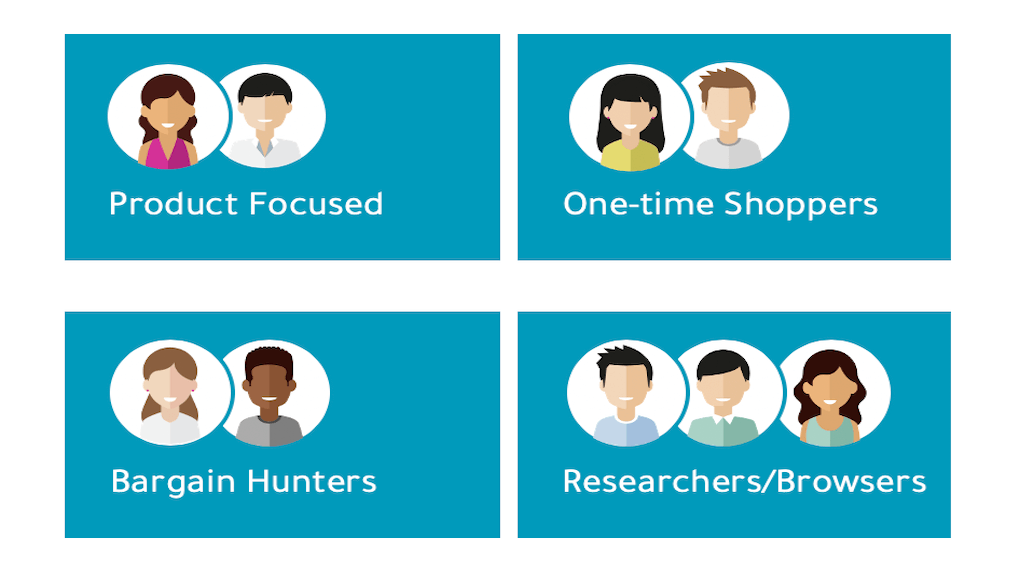
Here are some examples of how you can use personas to:
Let's face it: creating an eCommerce site can be fairly simple if you have a small number of products. But things get messy quickly as soon as you start expanding the catalogue.
According to the Baymard Institute: "product finding is key to any eCommerce business — after all, if your customers can't find a product, they can't buy it."
It doesn't matter how much time you spend on beautiful design and product photography. The customer's overall user experience falters if foundational information architecture (IA) elements aren't solid. Baymard's studies also highlight that:
"22% of major eCommerce sites lack intermediary category pages at the very top of their category hierarchy" and "54% of eCommerce sites suffer from over-categorization."
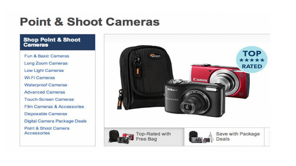
An example of "over-categorisation" — note how the "Point & Shoot Camera" category has incorrectly been implemented with the different "use types" as sub-categories, making it impossible to get a list of all point-and-shoot cameras.
In addition, we often see sites underutilize their filtering and sorting capabilities. This happens even though the majority of eCommerce platforms offer built-in functionality and a friendly setup. The takeaway is simple: think smart, but don't overthink it. Giving your customers a clear path to purchase saves them time and increases your sales. Our piece on a well-organized store structure that UX relies on is the right next read for the IA layer specifically.
When partnering with our clients, we strive to create not only a clear and intuitive store navigation, but also a foundation for eCommerce growth. There are different techniques we use to optimise store navigation — card sorting is one of them, a user research method used to evaluate or generate IA ideas based on how real users would group products.
Team alignment, personas grounded in research, and products that are genuinely easy to find — those three pillars are the recipe for eCommerce UX that converts. They also feed every other decision downstream, from product page design to checkout to retention. Our piece on the full eCommerce journey beyond the product page covers what happens once the foundational UX is in place.
If you'd prefer to partner with a tried-and-tested agency to create or refine your eCommerce store, our team can find clarity in the chaos of UX-led eCommerce design. Take a look at our UX/UI design services or get in touch.
UX in eCommerce is the discipline of designing every interaction a customer has with an online store — from landing page to product browsing to checkout to post-purchase — so that buying is intuitive, trustworthy, and free of friction. Good eCommerce UX makes the right action obvious at every step. Bad UX adds friction in places where competitors have removed it, and that gap shows up directly in conversion rate.
Because the gap between a store that converts at 1% and one that converts at 3% is almost always UX, not product or traffic. Visitors who can't find what they want leave. Visitors who don't trust the page leave. Visitors who hit a checkout that doesn't work on their phone leave. UX is the layer that decides whether your acquisition spend actually produces sales, or just produces visits.
Start with three changes in order: build cross-functional team alignment on what success looks like, develop user personas grounded in actual data (not internal assumptions), and audit your information architecture so products are genuinely easy to find. After that, work outward into product pages, checkout, mobile, and post-purchase. Most eCommerce UX gains come from removing friction, not adding features.
Start with the customer data you already have: site analytics, purchase history, customer surveys, post-purchase feedback, and support tickets. Map patterns — not individuals — across audience segments. Build three to five distinct personas, each capturing context, motivations, needs, and pain points. Validate them with at least a few real customer interviews. Use the personas as the lens for every design decision, from copy to layout to checkout flow.
The biggest wins on product listing pages are usually: a clean default sort order, robust filtering that matches how customers actually think (price, size, colour, use case), large enough product images to evaluate at a glance, prominent prices and stock status, and one clear primary action per product card. Avoid trying to communicate everything at once. Listing pages exist to help shoppers narrow down — the product detail page is where you go deep.
Combine quantitative and qualitative signals. Quantitative: conversion rate by funnel stage, time-to-purchase, mobile vs desktop performance, cart abandonment rate, search-result success rate, and task completion rate via tools like Hotjar or VWO. Qualitative: post-purchase surveys, usability testing with real users, customer support tickets and the patterns they reveal, and session replays of the moments where users get stuck.
The eCommerce sites with the strongest UX tend to share patterns rather than aesthetics: fast page loads on any device, a search bar that always works, filtering that matches real customer mental models, product pages that answer questions before they're asked, and a checkout that respects the customer's time. Brands like Allbirds, Glossier, and many DTC leaders set the bar — but UX isn't about copying their look. It's about applying the same underlying disciplines to your specific audience.
Design with community in mind, innovate with technology at heart, and drive business success by finding the sweet spot where they all converge.