Did you know that people with disabilities constitute the largest minority group in the United States?
At roughly 20% of the total population, they’re a diverse group that crosses lines of age, ethnicity, gender, sexual identity, and socioeconomic status. That means they’re a part of almost every brand’s audience — and are users that you may be alienating without even realizing it.
In fact, over 88% of websites are still not fully compliant with the latest web accessibility standards. That’s a huge roadblock for users with disabilities and those who rely on assistive technology online.
It also means recruiters are missing out on valuable talent, businesses are losing prospective customers, and the online world is less welcoming and inclusive for everyone.
We’ve spent years helping clients improve their approach to web accessibility and we’ve learned a few things along the way.
If you’re worried that you fall within that 90% of inaccessible brands online, here are five key priorities that will help you start building a properly accessible website.
Websites rely on compelling imagery and intuitive design to capture attention. They help guide your users through your site, and ensure your brand makes a strong first (or second, or third) impression.
But for users with low vision or those who rely on screen readers, your images may be causing more problems than they solve. In fact, if you put key information in your site’s imagery without ensuring it’s accessible to those users, you can completely disrupt their experience.
When it comes to your images:
This helps users with visual impairments understand the content, and lets screen readers parse any information you’ve shared. Remember: Decorative images (like stylistic dividers or purely visual elements) should have empty alt text to avoid cluttering screen reader output.
What goes into a good alt-text description? Keep it as brief as you can, provide specific details and context (like, why the image matters to the page), and keep it relevant to the content it supports—even if you’re describing a stock image.
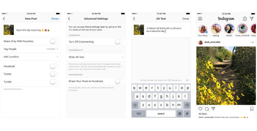
If a short alt text isn’t enough to describe the image (maybe it’s a dense chart, graph, or diagram), provide a brief summary through the image’s alt attribute. Then, include a longer description in the nearby text.
This way, you quickly convey whether the information is relevant, without forcing someone to sit through a lengthy screen reader transcription of info they don’t need.
Putting text inside images makes that text less accessible to screen readers and harms SEO—search engines can’t crawl text embedded in images, which weakens keyword relevance and page rankings. If it’s not part of your design, it should be easy to place somewhere else on the page.
Your images should pair with your content, rather than replace it.
And, as quickly as the technology is advancing, don’t delegate alt text to AI generators without oversight. While tools like automated alt text generators can save time, they often fail to convey the purpose of an image—instead of describing its context or meaning, they default to literal, low-value descriptions. AI still struggles with nuanced tasks like interpreting abstract visuals or prioritizing the important details for users with a screen reader.
Manual review ensures your alt text aligns with your content’s intent.
SEO best practices still apply — and trying to overstuff your alt text with keywords can backfire. This makes for a worse user experience, and even risks tanking your search engine placement.
You might think this grabs attention, but it can cause big problems for some users. Anything from annoyance to a headache to seizures in those who are prone to them. In other words, leave the garish GIFs in Geocities, where they belong.
No single page on your site is an island. Users rely on links to find their way around — that much shouldn’t come as a surprise.
But implementing your links in the wrong way can make that process unnecessarily difficult, and prevent different audiences from finding the information they need. When it comes to your links:
This lets users understand where a link will take them without having to rely on other content from the page. Clear URL structure, descriptive hover text, and even the text you use for the link itself should all clearly convey where the user is going to go.
Like this link, leading to our UX/UI design services page.
Strong CTAs are great, but they’re useless if your users can’t tell where they actually go.
Be sure to provide additional context so it’s easy to understand where clicking will take them — or use strong-but-specific CTAs like “download your copy”, “register for the mailing list”, or “sign up for the event”.
Multiple redundant links that redirect to the same location can make navigation even more confusing. If you can, group identical redirects into a single, clear link for clarity and ease of use.
Clear information architecture is crucial for an easy-to-navigate website. You might offer a best-in-class product or service for your users, but if you’re serving it to them with a scattershot, confusing presentation, they probably won’t care.
For users with dyslexia or other mental or learning differences, that kind of semantic confusion can turn any page into a nightmare to navigate. For your headings:
Remember, you should always use your headings and subheadings to organize your content. The goal is to help users more easily navigate your website, and headings should act as clear, concise markers that point them where they need to go.
This hierarchy should also act as a quick shorthand for which information is the most important to your users.
.png?width=753&height=422&name=Heading%20Hierarchy%20Pink%20%26%20Yellow%20%20(1).png)
While you might think these elements grab attention by breaking the established patterns of your site, they’re more likely to frustrate users and stop them from actually absorbing the information you want to communicate.
Building the right visual language for your brand takes time and the right strategy. Get it right, and you’re sure to stand out from your competitors.
But it’s important to remember that your design choices don’t just reflect your brand; they define your users’ experience whenever they interact with you.
Remember, making choices exclusively because they’re true to your brand’s visual identity or seem interesting is a surefire way to cause headaches for your audience. That’s especially true of users with visual impairments.
When it comes to creating legible content, your font choice and text size are only part of the picture. For users with any type of color blindness or a visual impairment, you need to ensure sufficient contrast between text/foreground elements and your page’s background.
This helps your users read your content easily — and makes them more likely to stick around. The US General Services Administration provides some guidelines and contrast tests here.
From the legends of graphs to font colors that designate a required form field, it’s easy to forget that some common design conventions rely on colors to convey critical information.
But these shortcuts can make that info completely inaccessible to users with color blindness, who, at best, will have to rely on trial and error or other tools to understand what you’re trying to convey.
Bunching different elements of your page together, in general, is a bad idea. It makes navigating each page more difficult and demands an unnecessary level of precision. This is particularly true for users with physical impairments or motor skill challenges.
Linking separate calls to action right next to each other makes it harder for users to reach the proper destination. Whether they struggle to differentiate between separate links or need to take extra time to find the right clickable element, this adds extra frustration for everyone.
You can be economical with your use of space, but don’t cram everything in together.
Think of every time you’ve struggled to tap a tiny link while navigating a page from your phone.
This sort of friction — elements that seem perfectly fine on one device but are a nightmare to navigate on another — are sure to crop up across your website until you plan for different devices. For users who depend on a touchscreen or other interface technology, this can make or break your site’s UX.
We get it. You want to stand out, and a unique font sometimes seems like a shortcut to generating visual interest on a page. But going for style over function in this case makes your content harder for users to read, especially if they have any sort of visual impairment.
Prioritize clarity, and let your actual content do the heavy lifting.
In other words, don't use extra spaces (or tabs) to achieve your formatting. After some trial and error, it might look fine, but this approach can break assistive reading technology. Instead, use <br/> where appropriate — and use it for semantics, not decoration.
These tips are by no means a comprehensive list of web accessibility priorities. There’s a lot to account for, and you’ll likely need support (either through online resources or working with experts) to get it right.
So why should you invest in building a properly accessible site for your business?
This one bears repeating. As a business or organization, it’s incredibly important to ensure that your website is accessible to everyone, regardless of their abilities. By taking the steps to make your website more accessible, you are providing all users with open, equal access to your information and services.
If users with disabilities can’t access your website or use your services, it also perpetuates exclusion and discrimination online.
With that said, there are also likely legal requirements that your site needs to meet when it comes to accessibility. Many countries, including the United States and Canada, have laws that mandate a certain level of web accessibility for people with disabilities.
So, on top of it being the right thing to do, failure to comply with these laws can result in legal action and fines for your business.
Of course, making your website accessible can also have some big benefits for your business. From a numbers perspective alone, the more people who can access your site, the more you can increase your audience and customer base.
But more now than ever, consumers prefer to give their business to brands that align with their values. Audiences recognize and respect genuine efforts to improve accessibility, and you’re likely to improve customer satisfaction and loyalty from across your audience — and build a positive image for your brand.
Many accessibility best practices—like clear navigation, readable content, and simplified forms—directly support Conversion Rate Optimization (CRO). When your site is intuitive and frictionless for all users, including those with disabilities, visitors are more likely to complete tasks (e.g., purchases, sign-ups, or inquiries). Better accessibility means fewer barriers, fewer abandoned carts, and more opportunities to grow your business.
A site that’s more accessible for users with disabilities also makes your website more accessible in general. Inaccessible content can actually impact search engine optimization (SEO) and prevent search engines from indexing your website properly.
That makes you harder to find for every potential user, whatever their ability.
Almost no site will have a perfect approach to accessibility right out of the gate. But it’s important to start somewhere — and these principles will benefit your entire user base even as they invite more people to your site.
Above all, the biggest DO is universal. Approach accessibility seriously and with your end user in mind. The biggest DON’T? Don’t rely on an accessibility widget as a quick fix. If you approach this work as an afterthought, it will show through — and you’re likely to alienate your audience as a result.
Want to make sure your next site meets accessibility standards? Reach out to Major Tom today.
Ideas grow best when they're watered by more than one mind.