Last updated: May 2026
Most websites work fine, technically. They load, the menus open, the contact form submits. But a captivating website does something a "fine" one never will: it holds attention, builds trust, and earns a return visit. The 10 things that make a website captivating fall into four buckets: cohesive visual design, intentional storytelling, intuitive UX backed by fast performance and accessibility, and an ecosystem that keeps users engaged across channels. This guide walks through each one, with the stats, examples, and small fixes that lift a good site to a great one.
What makes a website captivating, in 10 elements:
You've seen sites that have the information you technically need but lack the special something that makes them memorable. Personality. Intuitive navigation. A real understanding of who's visiting. These elements are easy to miss, but their absence isn't, especially when a competitor's site is quietly outperforming yours. If your website is missing one or two of these, it's probably due an update. Missing three or more, and it's time for a fuller overhaul. Let's get started.
Think of a consistent design system as your website's GPS. It keeps users oriented and ensures every interaction strengthens their relationship with your brand. For most visitors, your website is their first experience of you, and the first 10 seconds set the tone for everything that follows.
If the site looks clean and feels deliberate, users read your brand as professional and trustworthy. If it looks cheap or neglected, you spend the rest of the visit clawing that confidence back. A consistent design system is also the baseline for building a properly competitive website in any field.
For starters, make sure you:
First impressions are mostly visual. Online, that means your imagery, illustration, motion, and iconography all have heavy lifting to do. Investing in professional creative (or, sometimes, just the time to do it well in-house) is what separates a generic template from a captivating website.
A few small disciplines compound:
Mission Hill is a useful example of creative assets earning their keep. The brand-led site we built with them paired distinctive product photography and considered motion with a clean commerce layer, and the visual confidence flowed through to a 99% increase in website sessions. Visual investment is rarely just aesthetic; on the right site it shows up in the numbers.
"Storytelling" gets a rough time on LinkedIn, sitting next to "synergy" and "value-add" on the buzzword list. It still matters, but only if you actually put it to work.
Every story has a setup, a conflict, and a resolution. Your customer is the hero, and they have something they need. They set out to get it, something gets in the way, and eventually they find what solves it. Your website's job is to map that arc onto their actual journey, from landing to checkout (or quote, or contact form). When the journey reflects the story they're already running in their head, the path feels effortless.
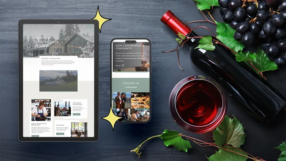
Take a wine connoisseur looking for a new local label. Packed online storefronts are a start, but the picture is incomplete: they want to know the place, the process, and the people. A site that tells that story on the way to checkout gives them everything they need to buy with confidence.
A few ways to keep storytelling honest:

A captivating website feels effortless. Clear navigation, simple menus, intuitive pathways, and a functional search bar are the floor, not the ceiling. Complex site usability is where most enterprise builds quietly fall apart, but the principle is the same at any scale: design around the actual journey, not the org chart.
Accessibility is part of intuitive UX, not separate from it. WebAIM's 2026 analysis of the top 1 million home pages found 95.9% had detectable WCAG 2 failures, averaging 56.1 accessibility errors per page. Low-contrast text, missing alt text, and unlabelled form fields lead the list, and every one of them quietly excludes users who would otherwise convert. Clear those barriers and the site is captivating to a far wider audience by definition.
Performance matters here too. Interaction to Next Paint (INP) replaced First Input Delay as a Core Web Vitals metric on March 12, 2024 (Google Search Central); the "good" threshold is INP under 200 ms. A site can be visually stunning and still feel broken if its buttons lag, so treat CWV monitoring as design hygiene.
Action-oriented design also matters. Make the next step obvious on every page, whether that's buying a product, booking a service, or reaching the team. If users have to hunt, you've already lost them.
Imagine going to the grocery store where nothing is where it should be, prices are missing, and the cashier asks you to fill out a questionnaire before you can pay. You'd absolutely leave without buying. Your website works the same way. If visitors can't find what they want, sort by what matters, or see clear pricing and descriptions, they'll go somewhere they can.
For commerce, that translates into a few non-negotiables:
The same principles apply to a lead-driven site: every form is a checkout, every CTA is a payment button. Treat them with the same care.
People love things that feel made for them. The coffee shop that remembers your order. Netflix surfacing something you actually want to watch. When a website hits the same note, return visits get easier and conversion rates climb.
Examples of smart personalization that work:
The line between personalized and intrusive is finer than it looks. Use just enough data to feel relevant, and stop short of feeling watched.
Keeping a customer is easier than winning a new one. A captivating website gives existing customers a reason to stick around: a membership programme, a loyalty tier, a community hub. Roller Rabbit is a fitting case here. The brand's site we rebuilt paired strong storytelling with thoughtful loyalty hooks and an obvious upgrade path, and the layered experience helped lift conversion rate by 176% post-launch.
What works in the patterns we see:
Updating your website shouldn't be an ordeal. A site that's a pain to edit slowly stops getting edited, and a stale site stops captivating quickly. Build with maintainability in mind from day one. Your team should be able to add products, post updates, or launch a campaign page without filing a developer ticket.
This is something Major Tom builds for on every project: intuitive backends, sensible content models, CMS training, and ongoing support for the edge cases. Equally important is choosing a stack that can grow with the business; picking the wrong platform can create much bigger problems down the line. Pair that with built-in analytics so the team can see what's working and where to invest next.
The more connected your brand feels across channels, the stronger it reads. Captivating sites don't live in isolation; they sit inside an ecosystem of email, social, paid media, search, and customer support.
A few practical moves:
Getting visitors to your site is great. Getting them to take action once they're there is what actually matters. There's no single recipe for effective CRO; you start by understanding your business goals and how customers actually interact with the site.
Track behaviour with GA4, Microsoft Clarity, or Hotjar to find friction. Then test small changes (page layouts, CTAs, product placements, form fields) to see what actually shifts the numbers. Most experiments won't move the metric, but the ones that do compound. As we like to say at Major Tom, sites are launched, not done, so plan accordingly. For a wider view of how this fits into a steady pipeline, our companion piece on turning a lead generation website around walks through the diagnostic and goal-setting work that should sit alongside ongoing CRO.
Whether you're fine-tuning a few details or planning a fuller overhaul, we can help you find clarity in the chaos. Explore our web design and development services or reach out to start the conversation.
A captivating website combines a consistent visual design system, original creative assets, intentional storytelling, intuitive UX backed by fast performance and accessibility, and a seamless conversion experience. It also extends beyond the site itself into a connected ecosystem of email, social, and search. The aim is a site that holds attention on the first visit, builds trust on the second, and earns a return on the third by feeling deliberate at every step.
A design system is a documented set of components, tokens, and patterns (typography, colour, spacing, UI behaviour) that keeps a website visually and functionally coherent across every page and breakpoint. It matters because consistency is what users read as professionalism and trust. A strong design system also dramatically speeds up future iteration: new pages, campaigns, and templates can be built from existing parts instead of from scratch, which is what keeps captivation compounding over time.
Storytelling gives visitors a reason to care. By framing the customer as the hero and shaping content around their actual journey, the site reads as relevant rather than promotional. It also creates connective tissue between pages: product details, brand history, sustainability practices, and tone of voice all reinforce a single narrative. The result is a site that feels considered rather than transactional, which improves engagement, recall, and the likelihood that visitors return.
Done well, personalization tailors content, offers, and recommendations based on user behaviour or segment, without crossing into surveillance. That can mean product recommendations from browse history, dynamic hero modules for returning visitors, lifecycle emails based on engagement, or segment-driven CTAs. The principle is to use the minimum data needed to feel relevant. Over-personalize and the experience reads as creepy. Under-personalize and visitors feel like every other anonymous session.
Yes. Accessibility issues like low-contrast type, missing alt text, unlabelled form fields, or unusable keyboard navigation directly degrade the experience for many users. WebAIM's 2026 audit found 95.9% of top home pages had detectable WCAG 2 failures, averaging 56.1 errors per page. Clearing those barriers widens the audience that finds the site captivating and improves SEO and AI answer engine visibility at the same time. Treat WCAG 2.2 AA as the baseline, not a stretch goal.
Decisive. Mobile devices account for 53.65% of global web traffic versus 46.35% on desktop, so the small screen is where most first impressions actually happen. A captivating site needs typography, imagery, navigation, and CTAs that work as well on a mid-range Android as on a 27-inch monitor. Core Web Vitals (especially INP under 200 ms) should hold up on mobile networks. Design mobile-first, then scale up, rather than treating mobile as an afterthought.
Small optimization work (content, CRO experiments, accessibility fixes, performance tuning) should run continuously, with monthly reviews and quarterly sprints. Larger refreshes (design system updates, template rebuilds, new functionality) typically happen every 18 to 24 months. A full rebuild usually lands on a three to five year cycle. The sites that stay captivating are the ones treated as living programmes; the ones that fade are the ones launched and left alone.
The better the data you look at, the better the decisions you'll make