Last updated: May 2026
A craft brewery website strategy has to do three things at once: tell a brand story worth choosing, get visitors into the tasting room or onto the doorstep, and sell beer, swag, and event tickets when they're not in town. The breweries we work with that nail all three see steadier foot traffic, stronger DTC sales where shipping laws allow, and a brand that holds its ground even as the craft beverage market tightens. This guide walks through how to build that brewery website strategy, from brand foundations to commerce, accessibility, and the unglamorous pages that quietly do most of the work.
What every craft brewery website needs to do:
Craft beer in 2026 isn't the wide-open growth market it was a decade ago. The Brewers Association tracked the first nationwide dip in independent US craft volume in a generation through 2024, and Canadian operators have felt similar squeeze from cost inflation and shifting drinking habits. Strategy matters more, not less, when the tide stops carrying everyone. Your website is the cheapest, most flexible marketing surface you own. Use it like one.
Your brand is your voice, your identity, and your values. People are buying craft beer for the same reasons they're buying craft anything else: they want a real story attached to the thing they're drinking, and they want that story to feel local, considered, and honest. The bigger national brands can't compete with you on that ground. Don't give it up by leading with a generic header image and a CTA that says "Find a beer."
The fastest way to lose the connection is to design a website that could belong to any brewery. The fastest way to keep it is to write the homepage like you'd describe the brewery to a friend at the bar. Why you started. Why this city. Why this beer. We've helped food and beverage brands bridge the gap between tasting room experience and digital presence at Major Tom, and the pattern that holds across all of them is this: visitors decide whether they like your brand in roughly six seconds, then spend the rest of the visit looking for reasons to confirm that decision.
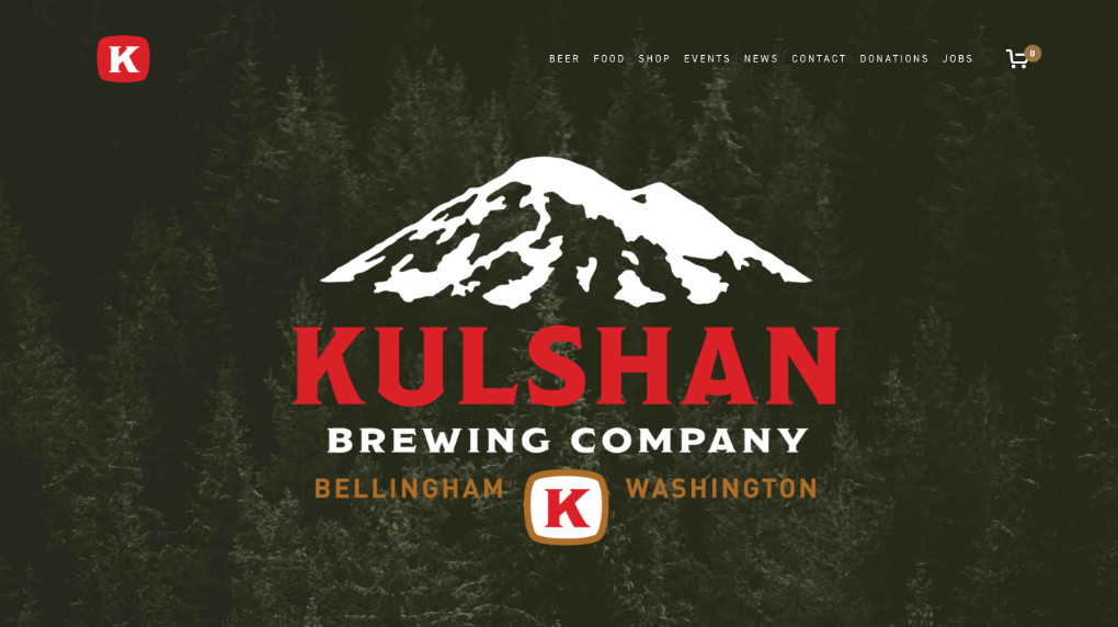
Take Kulshan Brewery in Bellingham, Washington. Their homepage cuts straight to the Pacific Northwest roots and the beers that come out of them. Field House Brewing from Abbotsford, British Columbia (the 2018 BC Beer Industry Awards "best website" winner) does the same thing visually. A scroll through their field log feels like sitting in the tasting room itself. Whatever your version of that is, lead with it.
Brand cohesion is the part most breweries underinvest in. The packaging looks great. The signage in the taproom looks great. The website looks like it was built two redesigns ago. The fix isn't a redesign every two years; it's a system that keeps the digital expression of the brand aligned with the physical one as both evolve.
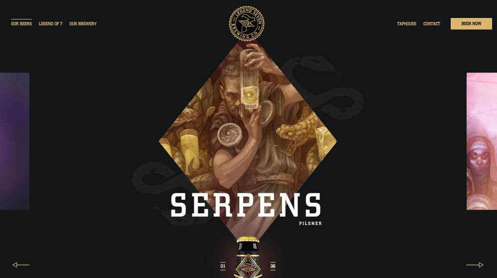
One of our favourite illustrations is Legend 7 Brewing in Calgary, Alberta, which Major Tom built. Their craft beer labels carry a series of beautiful, distinctive illustrations, so the website flaunts them at every opportunity. The labels you see on the can in the cooler are the same labels you see when you land on the site. That continuity is what people remember. (For more on building a brand story that translates across surfaces, see our piece on why every brand has a story worth telling.)
Your values are the part of the brewery website strategy that nobody clicks straight to and everybody uses. They're the compass for the content choices, the social tone, the merch decisions, and the partnerships you take on or pass up. Pick a few that genuinely describe how you operate (local sourcing, low-waste brewing, community partnerships, fair employment practices) and let them show up consistently across the site.
Customers in 2026 are noticeably more values-driven than they were when this blog first ran in 2019. They notice when the values copy on the About page contradicts the merch on the shop page, or when "community" in the copy means "we did one charity night three years ago." Be specific. Be honest. Customers reward both.
If you think about how people actually discover a new craft beer, it usually starts with a recommendation at someone's barbecue, a tap takeover poster, or a friend opening a can at the cottage. Then they look you up. Your job is to give the version of you they meet online enough confidence to plan a visit, place an order, or chase down a local stockist.
That means the site is, more than anything else, task-based. Treat it that way.
A bullet list of beers under one header isn't a beer page; it's a placeholder. Each beer deserves its own page with: ABV, IBU, style category, flavour notes, the story behind it, packaging photos, where to buy, and (if you're doing it well) some signal of seasonality and stock. The MISE principle (Make It Super Easy) applies here as hard as anywhere on the site, and we've covered it at length in our piece on the MISE principle for selling a product online.
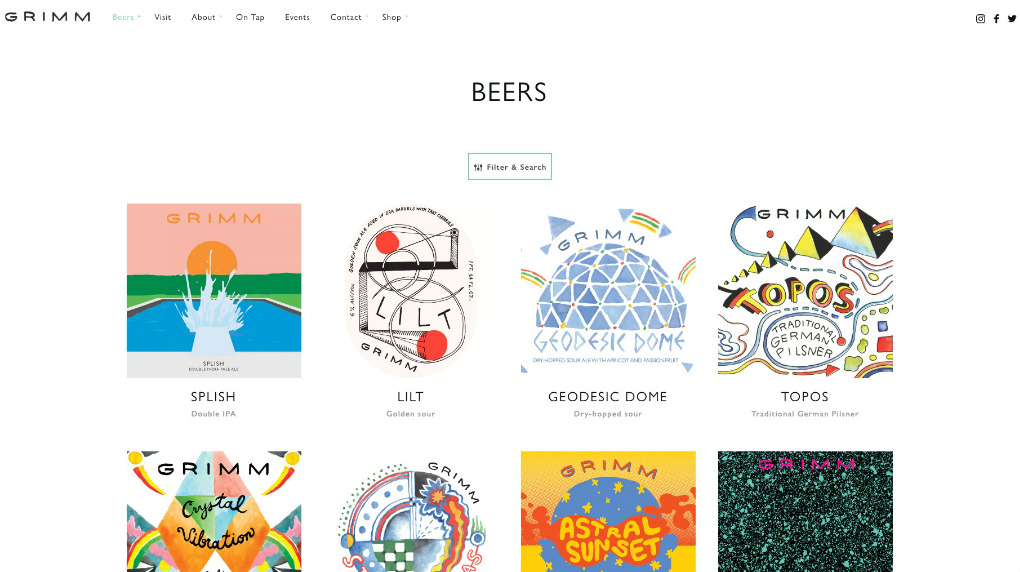
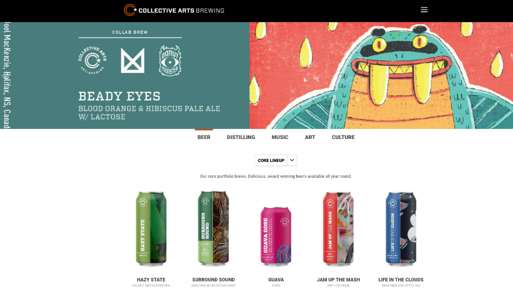
Grimm Ales from Brooklyn, New York is the gold standard for beer-page browsing: every beer they've ever released, filterable by style and flavour profile, with enough detail that someone who's never tried them can still pick something they'd like. Collective Arts Brewing in Hamilton, Ontario hits a similar note. The bonus from doing it this way: each beer page becomes its own SEO surface, and the right schema markup ties it back to the brand. There's a dedicated schema.org type for breweries that you should be using on the site root, alongside Product schema on each individual beer.
The single most common reason someone visits a brewery website is to figure out whether to visit the brewery. Hours, address, parking, dog policy, food (truck, kitchen, or BYO), live events, growler fills, and reservations should be one click away from any page on the site, not buried four levels deep on a "Visit" page.
Reservations are worth specific attention. Tools like Tock, Resy, and OpenTable plug into most modern websites cleanly, and they reduce the no-show rate on event nights significantly compared to email or DM-based booking. If you're hosting tap takeovers, food collaborations, or trivia nights, the events calendar and the reservation flow should sit together, not on separate pages with separate ownership.
This is where the 2019 version of this post fell short, and where the modern brewery website strategy has the most room to grow. Direct-to-consumer beer shipping is now legal across most US states for in-state delivery and a growing number for interstate (the legal map is still moving, so check your state's shipping rules before promising anything on a checkout page). In Canada, provincial liquor authorities still gate most cross-province shipping, but in-province DTC is well-established.
Where you can ship, your website should be doing it. Where you can't, the same eCommerce muscles still apply to merch, gift cards, brewery tour tickets, beer school sessions, and pickup orders for the taproom. The DTC craft brands we work with treat their website as a revenue channel, not a brochure, and the cadence of campaigns (limited releases, subscription box drops, collab announcements) is what keeps return visits compounding.
A practical note: the same operational discipline that drives any lead-generation website from underperforming to ever-improving applies here. Measure the conversion funnel weekly. Test the product page hero, the checkout flow, and the limited-release announcement format. Treat the site as a living storefront, not a one-time project.
One Major Tom case study worth name-checking: Hopwater Distribution in San Francisco. We built the digital experience around their downtown taproom and craft distribution business, and the lesson was the same as every craft beverage brief we've taken since. The taproom is the heart of the brand. The website is the front door. Make the front door wide.
Roughly one in five visitors to your site has a disability that affects how they use it. That's not a fringe accommodation; that's an entire fifth of your customer base. The Web Content Accessibility Guidelines (WCAG) are the standards to design and develop against, and they cover the obvious things (alt text, colour contrast, keyboard navigation) and the less obvious ones (form labels, focus states, reduced motion). Our piece on accessible web development walks through what to ask for and what to refuse.
Accessibility is also a legal exposure question that has tightened since this blog first ran. US plaintiffs filed 3,117 federal website accessibility lawsuits in 2025, a 27% jump from 2024 (Seyfarth Shaw, ADA Title III News & Insights). The plaintiffs aren't always sympathetic, but the standard is real. Build for it from the start and you don't end up retrofitting under deadline pressure.
Most brewery website visitors arrive on a phone. StatCounter's April 2026 data puts mobile at 53.65% of global web traffic, and the share is higher in food and beverage categories where people are looking up hours and menus on the move. If the site doesn't load fast on a phone, on a patchy cellular signal, in a parking lot, you're losing the visit before it starts.
That means three things, in order:
The breweries that come through the next few years strongest will be the ones whose websites earn their place in the marketing stack: telling a story worth choosing, selling where the law allows, filling the taproom, and treating the digital experience with the same care as the physical one. If you'd rather not build that from scratch, our web design and development practice covers the strategy, build, and ongoing optimization loop, with brand strategy sitting alongside it for the foundations. We've worked with craft brewery, food, and beverage brands across both, and the best results come when both sides move together. Find clarity in the chaos, and pour something worth coming back for.
At minimum: a clear brand story on the homepage, individual pages for each beer with ABV, IBU, style, and flavour notes, tasting room hours and address surfaced from every page, an events calendar with reservations, online ordering or merch where legal, and an accessible, mobile-first design that loads fast on a phone. The goal is to translate the in-person tasting room experience to the digital surface so visitors get the same brand impression before they arrive as they do when they walk in.
Lead with photography or short video that captures the physical space (the bar, the brewhouse, the crowd). Pair it with the practical details: hours, address, parking, dog policy, food, and reservation flow within one click of the homepage. Embed your Google Business Profile, add Brewery schema markup, and keep the events calendar and reservation tool integrated rather than siloed on separate pages. The aim is to give a visitor enough confidence to plan a visit without needing to call.
In many places, yes. Direct-to-consumer beer shipping is legal across most US states for in-state delivery and a growing number of interstate routes; the legal map is still shifting, so check your state's current rules before launching a shipping checkout. Canadian provincial liquor authorities still gate most cross-province shipping, but in-province DTC is well-established. Where shipping isn't legal, the same eCommerce setup powers merch, gift cards, tour tickets, and taproom pickup orders.
For most independent craft breweries, WordPress paired with WooCommerce or Shopify is the right starting point. WordPress gives marketing teams a usable editor and the largest plugin ecosystem on the web; Shopify is a strong choice when DTC sales are the primary commercial goal. Drupal can be the right call for very large brewery groups with complex content and permission needs, but it's overkill for most single-location operators. Whatever you choose, prioritize mobile performance, accessibility, and structured product data.
Treat the website as the centre of gravity and the social channels, email list, and Google Business Profile as feeders into it. Publish limited-release announcements, taproom events, and behind-the-scenes content on a steady cadence. Run local search ads around "brewery near me" and "[city] taproom" queries. Build an email list from reservation flow, beer school signups, and merch orders. Most importantly, photograph the physical experience well. Craft beer is a visual category, and great photography moves more product than great copy.
The Web Content Accessibility Guidelines (WCAG) set the standard. The basics: sufficient colour contrast between text and background, alt text on every image, full keyboard navigation, visible focus states, form labels that screen readers can announce, and reduced-motion options for users who need them. Test with screen readers, keyboard-only navigation, and tools like axe DevTools. Accessibility benefits every visitor. The design discipline it imposes (clear hierarchy, readable typography, predictable navigation) makes the site better for everyone.
The content should refresh constantly: new beer releases, taproom events, collabs, and limited drops. The site itself should get a meaningful structural review every 18 to 24 months and incremental optimization every quarter (performance audit, accessibility check, conversion-funnel review). Treat the site like a tap list: rotate the seasonal content, keep the core year-round pages sharp, and retire what isn't earning its place. A static brewery website ages noticeably within a year.
The better the data you look at, the better the decisions you'll make