Identifying and addressing the root cause of problems is crucial in improving the user experience. While it may not be possible to achieve perfection in design, you can minimize errors and remove the obstacles that hinder users' progress. With the skills to identify bad UX, recognize common mistakes, and know the solutions and methods that will serve you best, your UX execution will be flawless.
Part II in this two-part series will give you these skills, and more.
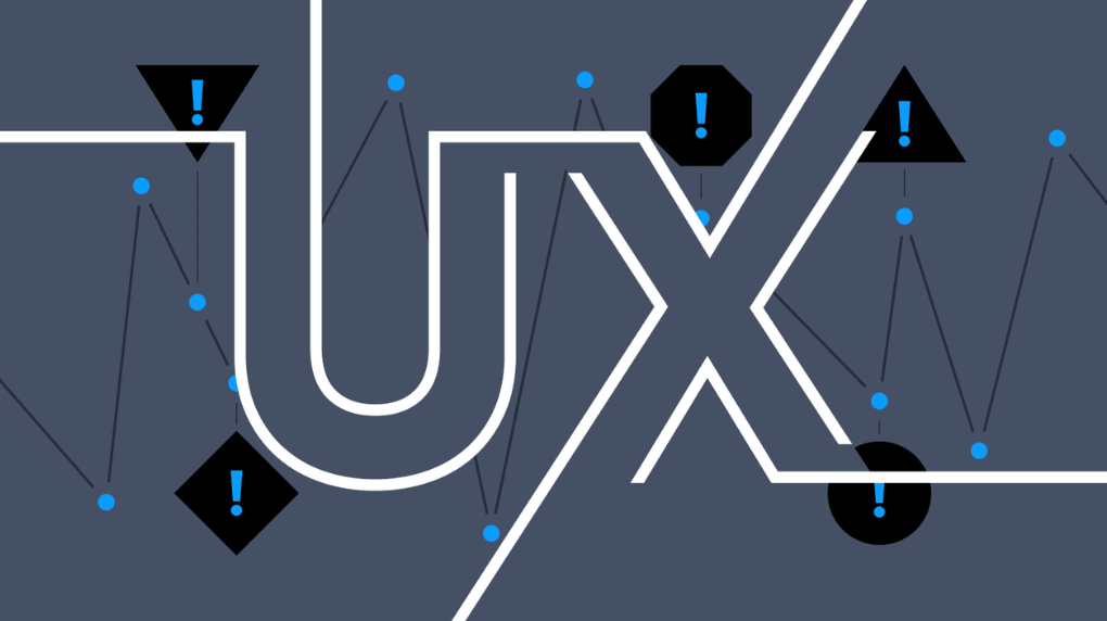
It's a common misconception that good UX is only about having attractive visual design and interactive features on a website. However, the primary goal of UX is to solve a user's problem.
If a user is unable to achieve their desired outcome on a website, even if it has visually appealing elements, it’s still considered bad UX. Bad UX, in short, is when a website fails to meet the needs and expectations of the user.
Identifying bad UX isn’t complicated, as its outcomes are unmistakable. One way to identify specific issues is to conduct a comprehensive UX audit, but even before that, you can check for certain red flags. These can be divided into two categories:
If you notice multiple issues in either of these categories, it may be time for a UX audit.
Common business outcomes that are directly related to poor UX include:
A website should be visually appealing, professional, and reflective of the brand's values. A clean, modern design and easy-to-use navigation can help improve the website's appeal.
Changes to the website should be based on user testing and data analysis. Changes that do not improve the user experience or lead to a decline in website performance should be re-evaluated.
If users are contacting the website's support team frequently, it may indicate a poor user experience. Providing clear, accessible information on the website and a user-friendly FAQ can help improve the user experience.
The time it takes to complete a task on a website can vary depending on the complexity of the task and the website's design. However, a task on a website should take no more than 10-15 seconds to complete and feel reasonable to the user. The website should be designed to minimize task completion time by providing clear instructions, reducing steps, and using intuitive design.
The idea behind usability is straightforward: if a product or website is easy to use, the user experience is good. A key principle of UX design is that "good UX is invisible," providing a seamless experience.
The issues with usability are often visible and can be addressed through careful analysis and simple design. Some common problems that can negatively impact the user experience include:
By keeping an eye on both your business and usability outcomes and you’ll be well on your way to spotting UX red flags before they become an issue. Of course, knowing the red flags to spot is only half the battle. You’ll also want to implement methods for improving your UX.
Fortunately, there are many tried and tested methods you can work into your overall UX strategy. Here are three of Major Tom’s team favorites to get you started:
User testing is a common method for detecting issues with user experience. It involves recruiting a group of users to interact with a website or application and providing feedback on their experience. This can be done in a variety of ways, such as through:

There are various tools available that can help you track user behavior on your website. `
Google Analytics is a popular tool that allows businesses to track the number of visitors to their website, as well as how they arrived at the site and what actions they took while there.
Heat maps and session recordings, such as those provided by Hotjar, can also be useful for visualizing where users are clicking and how they are interacting with different elements on a page.
It's important to regularly review and analyze the user experience of a website or application, as even small issues can have a big impact on the overall usability and effectiveness of the product. Your data and metrics are one of your most powerful tools in keeping your UX functioning as it should.
When you decide on the UX metrics to focus on, think of your specific goals or the needs of your product or service. Some common UX metrics include:

It is important to select the right UX metrics for your product or service and to track these metrics over time so you can identify trends and areas for improvement. By analyzing UX metrics, you will gain valuable insights into how users interact with your product or service. From there, you can make informed decisions about how to optimize your user experience.
It’s also important to be wary of common mistakes your team (or you!) may make when executing your UX strategy.
There are a few common UX mistakes designers may make; we’ve outlined the five that we see most repeated below. And, of course, we’ve also provided the solution to them.
75% of users form opinions about a website's credibility based on its appearance within an average of 3.42 seconds. After their initial impression, users consider whether the website can help them achieve their goals.
While aesthetics play a role in creating a good user experience, they should not be prioritized over functionality. If a user is unable to complete the desired action on a visually pleasing website, they will look for an alternative that meets their needs.
You can have the loveliest eCommerce site in the world, but if someone can’t find your check-out page, they’ll be bouncing away without purchasing anything.
On the other hand, a website that prioritizes functionality over aesthetics may not be memorable or engaging for users. It is important to find a balance between functionality and creativity in order to provide a positive user experience.

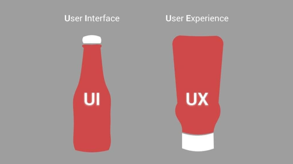
UX is not the same as UI.
UX design is crucial for creating a successful website or app. It focuses on solving user problems and creating an easy and helpful experience for users. This includes creating plans for navigation, information, and interaction.
UI design may be tempting to focus on first, but it's important to prioritize UX before aesthetics. A good-looking website or app is useless if it doesn't work well and provides a positive experience for users.
Focusing too much on UI design without considering UX can lead to failure. A balance between both UX and UI is necessary to ensure users have a positive and functional experience.
UX design is focused on creating the best possible experience for users, rather than the preferences of designers or stakeholders. While it is important to be innovative, this does not always result in a positive user experience if it makes it difficult for users to find what they need.
Smart design involves knowing when to use existing patterns and when to create new ones, while still maintaining a fresh and unique look. Using intuitive patterns can make websites easier to use and enhance the user journey, without sacrificing creativity. This allows designers and developers to focus on other aspects of the design process and avoid constantly starting from scratch.
After identifying a problem that needs to be solved, the next step is to analyze the best solution. While there may be multiple options, it is important to choose a single pattern to follow.
If there are several patterns that seem equally important, an A/B test can be used to make a decision. Once a pattern has been selected, it can be documented in a pattern library for use during the wireframing stage and to ensure consistency throughout the website.
Some of the most common patterns to take into consideration are:
Design trends are constantly changing, and it can be tempting to adopt popular trends that users may enjoy. However, it is important to choose trends that are scalable and appropriate for the product or website.
Complex or short-lived trends can be costly and may not provide long-term benefits. Select the right trend from the outset and then optimize the website based on user feedback and behavior.

To determine the most suitable trend for your website, consider the perspective of the user and ask yourself the following questions:
Failing to consider the user's needs and issues is a major flaw in UX design. The primary objective of UX is to offer solutions to user problems, and if this is not the focus, the product or website will not be useful to anyone.
It’s common for designers to neglect the needs and problems of users and rely on assumptions rather than seeking input from the target audience. To truly address user problems and facilitate a positive experience, it is essential to understand the issues users face and base design decisions on valid data and information.
Ignoring user problems and lacking real audience input leads to designs that are purely speculative and not grounded in reality.
In order to make informed decisions, it is important to conduct thorough UX research. The most effective way to anticipate user needs is to observe users firsthand through quantitative research, which provides real-time feedback on user behavior that can be incorporated into the design.
More importantly, considering users as individuals and trying to understand their perspective can help empathize with their journey and design accordingly.
It is not uncommon for designers and developers to have conflicting opinions and difficulty working together on design decisions. User experience involves many different disciplines, and it is rare for one person to excel in all of them.
Successful UX requires a team effort and cannot be achieved by a single UX expert. While ideas may seem feasible on paper or as prototypes, turning them into a functional website can be a complex task.
When teams don’t collaborate effectively in the early design stages, it may lead to increased costs or time constraints, causing tension with stakeholders. In addition, developing unplanned designs under limited time and budget constraints may not always produce the best results for users.

To ensure the success of a website, it is important to involve multiple teams, such as SEO, UX, UI, development, and content, in the collaborative process from the beginning.
By working together from the ideation stage, all ideas can be considered, and everyone can understand the possibilities and limitations. One effective way to organize this process is to create a Gantt chart or similar document to outline the tasks and stages involved. This helps to keep all teams on the same page and informed about design decisions.
Keep in mind that mistakes are normal, especially if you’re just starting out. The best way to approach UX is to fail-forward. Learn from the mistakes you’ve made in the past and the common mistakes others make, and keep working toward your UX goals.
We’ve said it before, but perfection doesn’t exist in design. Work hard but be patient, complete UX transformations do not happen overnight.
A UX transformation refers to the process of improving the way that users interact with a product or service. This can be done through various means, such as redesigning the user interface, improving the product's usability, or adding new features that enhance the user experience.

Consider these examples of UX transformations:
Overall, the goal of a UX transformation is to make the product or service more intuitive and enjoyable for users, resulting in increased satisfaction and loyalty.
UX transformations don’t have to happen overnight (and often don’t).
Constant upgrades, no matter how small or big, can impact the overall goal and growth of your business tremendously. Take Apple, for example. The great website that you see today was not created in a single shot. Apple has undergone several UX transformations of its website over the years.

In 1997: The website looked more like a newsletter
In 1998: The first major change towards the future website was initiated. A simplified homepage was launched, and an actual product image and GIF were added.
Over the years, Apple has continued to make changes, such as adding its logo instead of the Apple text and making the newest products launched products front-and-center.
In 2011: The first version of the darker NAV BAR that's seen today appeared.
In 2013, Apple overhauled its website with a new design that featured large, high-resolution product images and a layout that prioritized simplicity and clean lines.
In 2016, Apple added a "Today" tab to its website, which featured new and highlighted content like articles, videos, and interviews.
In 2017, Apple made changes to its website that put a greater emphasis on content and storytelling. The redesigned site included more white space, larger and more immersive images, and a streamlined navigation system to make it easier for users to find what they needed.
In 2021, Apple redesigned its website again, this time implementing a "card-based" layout with a focus on simplicity and clarity. The update included a new font and color scheme and the incorporation of more immersive images and videos.
In summary, the Apple website has undergone several redesigns over the years, with a focus on improving the user experience by making the site more visually appealing, easier to navigate, and better at showcasing the company's products and content. This UX transformation was a marathon, not a sprint.
A website's success is a continuous process, not a one-time event. With technology constantly changing and new trends emerging, it's important to continually update and improve a website to keep it relevant and effective. Even when a website is performing well, you should continue monitoring and improving it to ensure ongoing success.
Looking for a UX transformation for your own site? Discover how our services can help exceed your website goals
Design with community in mind, innovate with technology at heart, and drive business success by finding the sweet spot where they all converge.